Norcal Metro Regional Rail Transit Map
How NorCal Gets Around in 2051
This is a comprehensive rail transit spanning 51 zones with numerous cities and multiple operators. Using this map and your statewide Poppy Card, all of metropolitan Northern California is reachable by rail. Just find your starting point and ending point, count the zones in between, and go!
Description:
This is the latest rendition of a comprehensive unified map to the entire San Francisco Bay Area's (and greater Northern California) rail systems. In this map I have taken the splintered myriad of public rail transit networks and put them into one cohesive system. The map also speculates a few decades (2050) into the future with the inclusion of a second Transbay Tube, the Downtown Extension (DTX), California High Speed Rail, etc. Much of these inclusions are based on proposed and discussed projects in the megaregion. However, some are extrapolated services and networks that have yet to be discussed, and only exist in fiction only. The idea is to show what the future of rail in California can offer and what it might look like 10, 20, 30+ years down the road.
Process:
The start of this project began with research. There are numerous urban mobility projects that are in various stages of development in the San Francisco Bay Area. To make a comprehensive map of what the Bay Area’s rail system would look like a couple decades from now, I needed to do the research and find all of the projects currently under study, development, and construction. Even in this version of the map, I have surely forgotten some projects under study that would fit beautifully in a future rendition. I visited various municipal, regional, and state level website to source information or routes, pathing, stations, and service types to help inform how the map would ultimately look.
With this information, I began planning the layout of the map. I wanted to highlight each service on the map as its own line while keeping it under one cohesive design language. This was to reflect the fractured nature of the Bay Area public transit system, where bus and rail networks are divided into dozens of agencies and organizations.
From there, I laid out the service lines and then the stations. All the artwork was done in Adobe Illustrator. Back in 2016, I made my first iteration of the map, shown below.

Very early iteration, circa 2016.
This map from 2016 was my first attempt at making a large, integrated map. Since then, my style and skills had evolved. Additionally, new projects were proposed and others shelved. In particular, Link21 and other high-profile projects began to take the spotlight. By late 2019, I had a growing interest in returning to this project and a serious and meaningful upgrade with a proper design workflow and thorough research. There are several difference and improvement between the first map and the current one.
Initial Sketch:
A rough sketch of the primary services I wanted to feature.
Formatting and layout of the map began with a rough sketch to get the general shape of the system figured out. This was done in Adobe Fresco and was very basic. I took the bones of my old map give a basic, initial form but beyond that, everything else would be new. I needed to get a macro-level view of how all the components would fit and make some higher-level decisions on what direction this map would take.
This new map includes several new proposed routes that are being developed, as well as some extrapolated notional services that aren't being currently discussed. I also amended some services to match new developments, and added a new rail service level: Light Rail.
Once I got the basic alignments of each line figured out, it was a matter of converting the sketch into a proper map made in Illustrator. This began with the lines and station names. I also began experimenting with different ways to display the lines to see if there was any improvements that could be made. One of these iterations had modified colors as seen below.

An early iteration of the map with featured different color coordination. The idea was to keep lines colors clustered with specific operators.
This early version had the line colors grouped to better match the different types of services. For example, all BART lines are a shade of blue. This was done to put the emphasis on system unification and cohesion. However, after some initial testing, it was deemed that using hues like these muddled the clarity of each line. It was difficult to see clearly which line was which and made navigating the map more difficult. Original line colors were preserved in most cases, and some color group was used for other systems where it was deemed fit. You can see this in the 3 shades of green used for the SMART line in the North Bay Area.

Grouped line colors. Works to show different service providers. Doesn’t work as well to show which line is what.

More individualized line colors. Easier to tell apart each line at the cost of showing service provider.
After developing a common language for the lines, it was time to work on the legend and wayfinding in the map. The previous legend placed systems into a hierarchy and still delineated heavily between different types of service. This time, I wanted to present the system in a more unified manner also explore other ways of explaining the logic behind the map. It was here I took inspiration from maps of the Tokyo rail network with their usage of line codes, station numbers, and transfer hub abbreviations.

An English-focused map of the Tokyo rail network made by JR EAST. Note the use of line codes like JY and station numbers. Additionally, note the use of three letter station abbreviations for large transfer hub stations on the network.
Image Credit: Tokyo Maps / JR East
Using this a basis, I redesigned the wayfinding and legend of my map. This started by giving each line a code (BART = BA, Capitol Corridor = CC). Next and counted the stations and assigned a number to each one. This number differed depending on each respective line, and the color and styling of the line code matched the color styling of the line itself (in general, this is not reflected in the BART code). Then, larger hub stations, which were already characterized by a white bubble received a three letter abbreviation. This was all assembled into a legend that showed how each line and station differed.
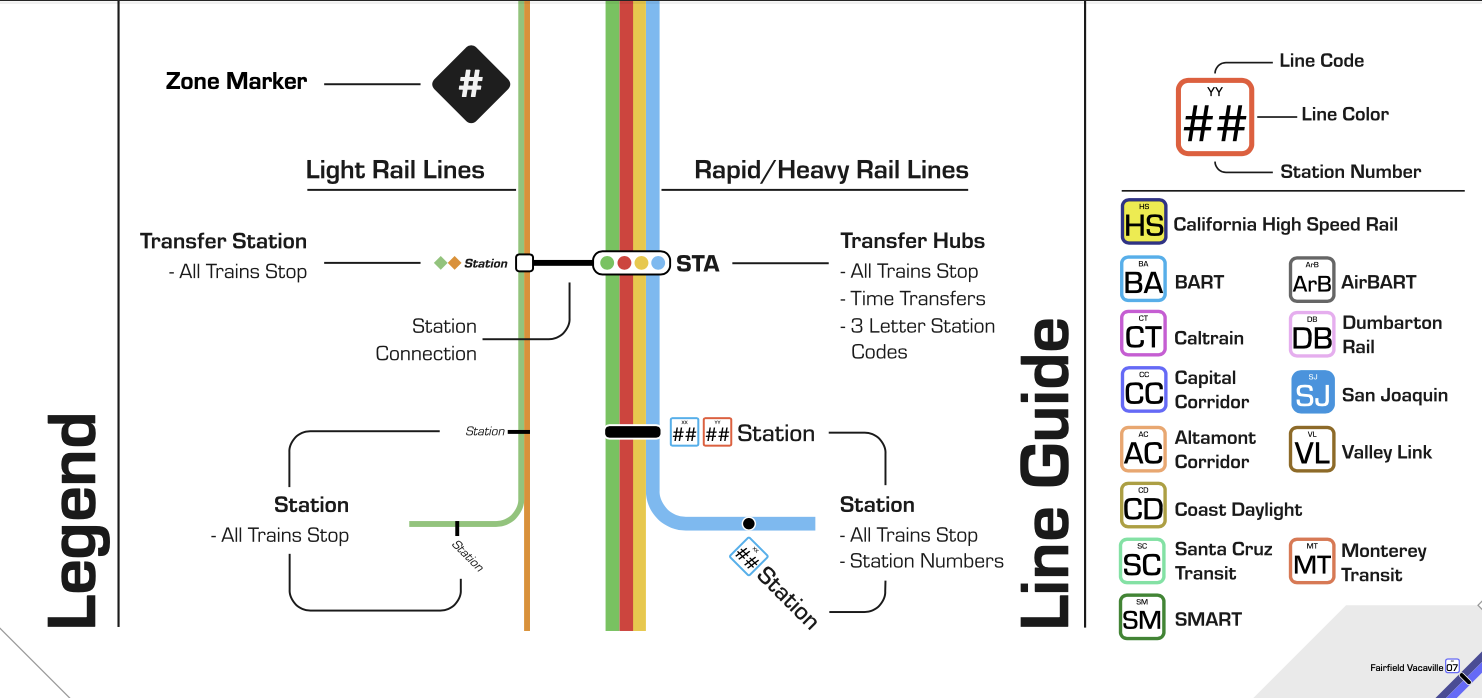
The final legend and line guide for the map. Note: the light rail lines do not receive the same line code and station number treatment.

A section of the chart of transfer hubs available.
By following this standard, I was able to bring all the lines and stations into a common design language for a user to follow along with. Beyond this implementation, I then took inspiration from Seamless Bay Area’s work in developing a zone-based fare design for the map. The idea is to make fare calculation straightforward and easy for any rider. The zones are marked with black borders and colored in with varying shades of white to dark grey. A black diamond with zone number is then assigned to each zone. In total, there are 51.
Beyond the map, I also wanted to do a little bit of branding to sell the idea that this map represented a unified rail network that spanned all of Northern California. To achieve this, I worked on a Norcal Metro Logo, as well a notional statewide IC transit card called Poppy, after the state flower.
The Norcal Metro Logo is simple and straightforward. It was directly inspired by the old Caltrain Logo and Livery of blue and turquoise, which reflects its Caltrans origins back in the 1980s.

The Norcal Metro Logotype.

The vintage Caltrain livery using California Department of Transportation (CalTrans) colors.
Photo Credit: Caltrain
The Poppy IC Card was designed as an idea to illustrate what a statewide transit payment system could look like. The design was inspired by the California Golden Poppy with elegantly swooping forms of golden orange forms behind a sky blue gradient. Several other iterations were also considered that used a color pallet that centered around the poppy, but instead of focusing on the flower, the ideas was to focus on movement. After some A/B testing with other views, the more elegant flower design was selected.

Several of the considered designs.

The final design of the IC card.
And that is the Norcal Metro Rail Transit Map! Feel free to view the map in PDF form by following the linked button above. I had a lot of fun and learned a lot while put this together and I hope you find as much joy going through it. In the future, I’m hoping to develop it further by incorporating more projects and proposals that get planned. I’m also planning on creating an interactive version down the road. Here’s hoping that much of this map actually makes it into reality come 2051.